Salon & Spa at the Park

September 4, 2025

Transforming Salon & Spa at the Park’s Identity: Branding, Web, Print & Email Solutions

When Salon & Spa at the Park—an upscale collection of private, customizable salon and spa suites in Southfield, Michigan—needed a unique brand presence, we were thrilled to bring their vision to life. Here's how we elevated their image across every touchpoint:

Logo Design: A Mark of Elegant Professionalism


We created a refined logo featuring sophisticated gold and black tones that mirror the luxury and exclusivity of their spaces at Salon and Spa at the Park. It conveys both glamour and modern professionalism, ensuring the brand stands out in a competitive market.

Logo Design

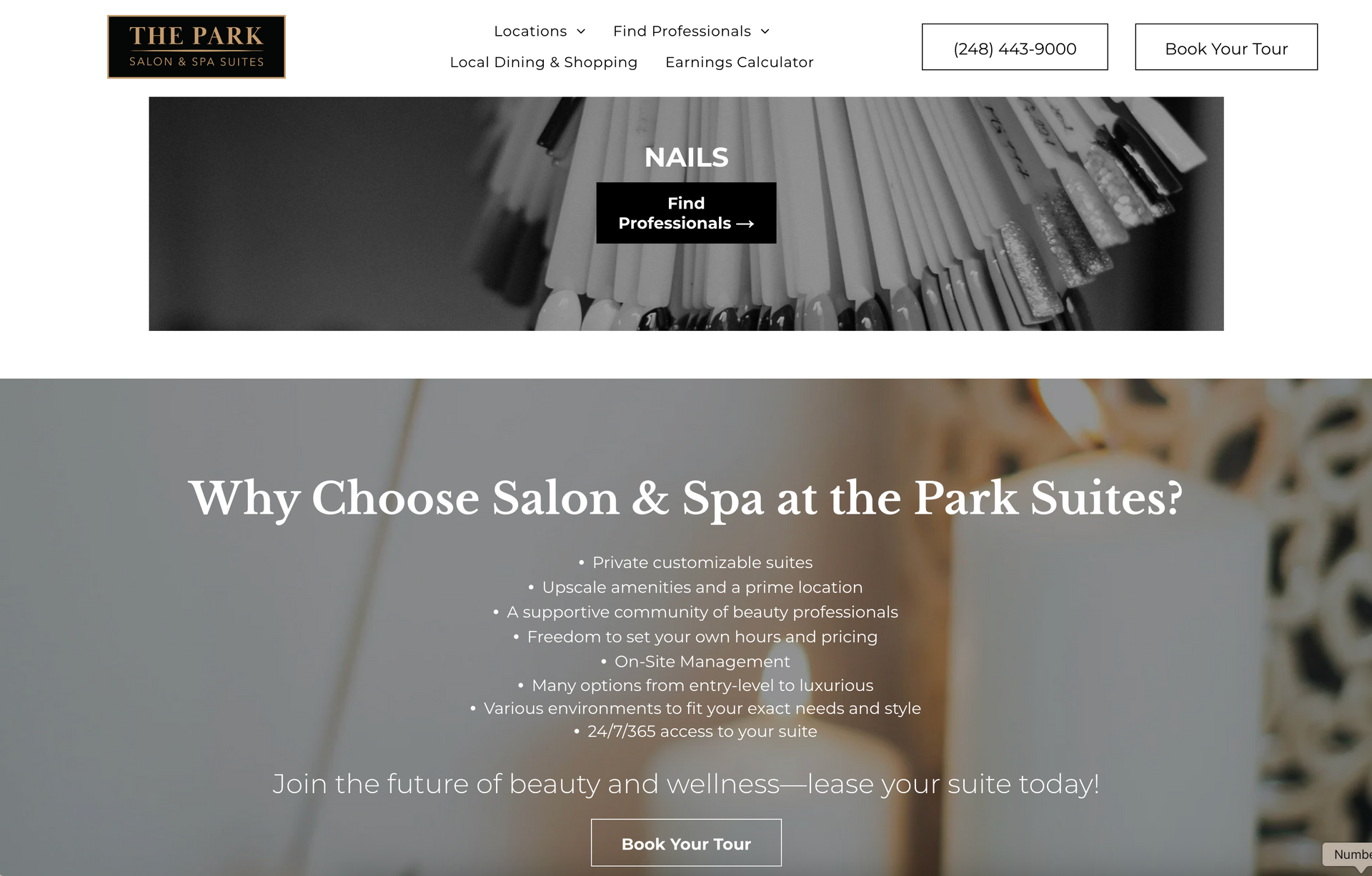
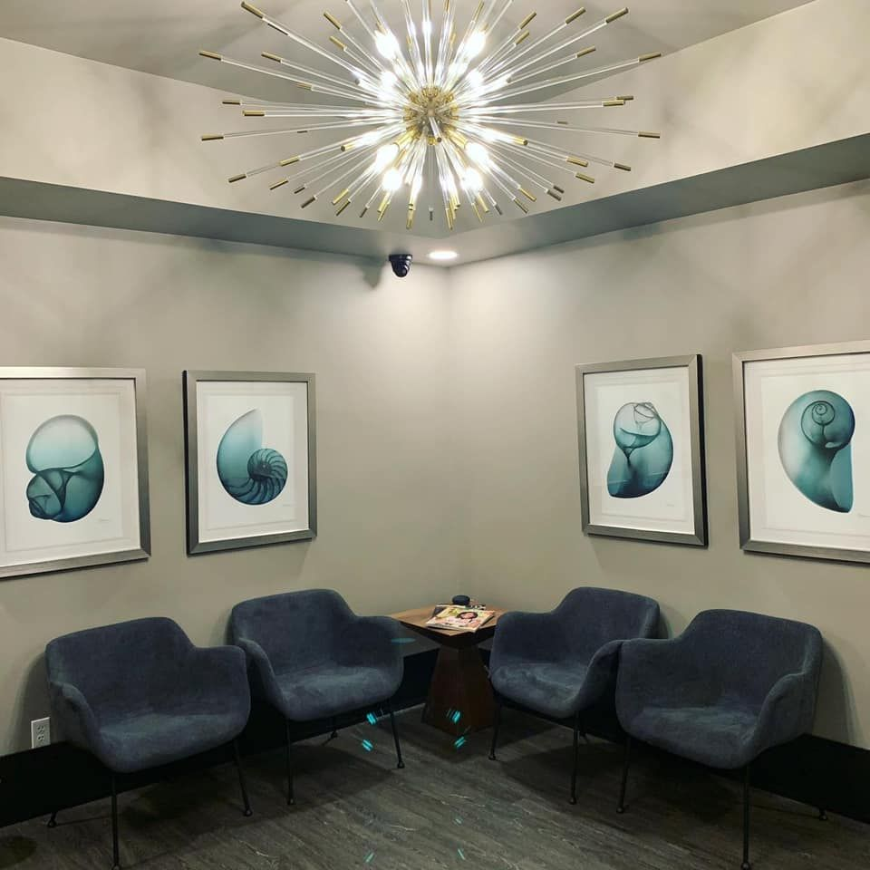
Website: Showcasing Spaces That Inspire


Their website now beautifully showcases the “Salon at the Park – East,” “West,” and “Spa at the Park” locations, along with suite details, leasing opportunities, and easy booking tools. Our design emphasizes:

  • A clean, upscale aesthetic aligned with their brand.
  • Clear and inviting calls to action like “Book Your Tour.”
  • Integrated tools such as the earnings calculator that empower prospective tenants of Salon and Spa at the Park.
Website Design

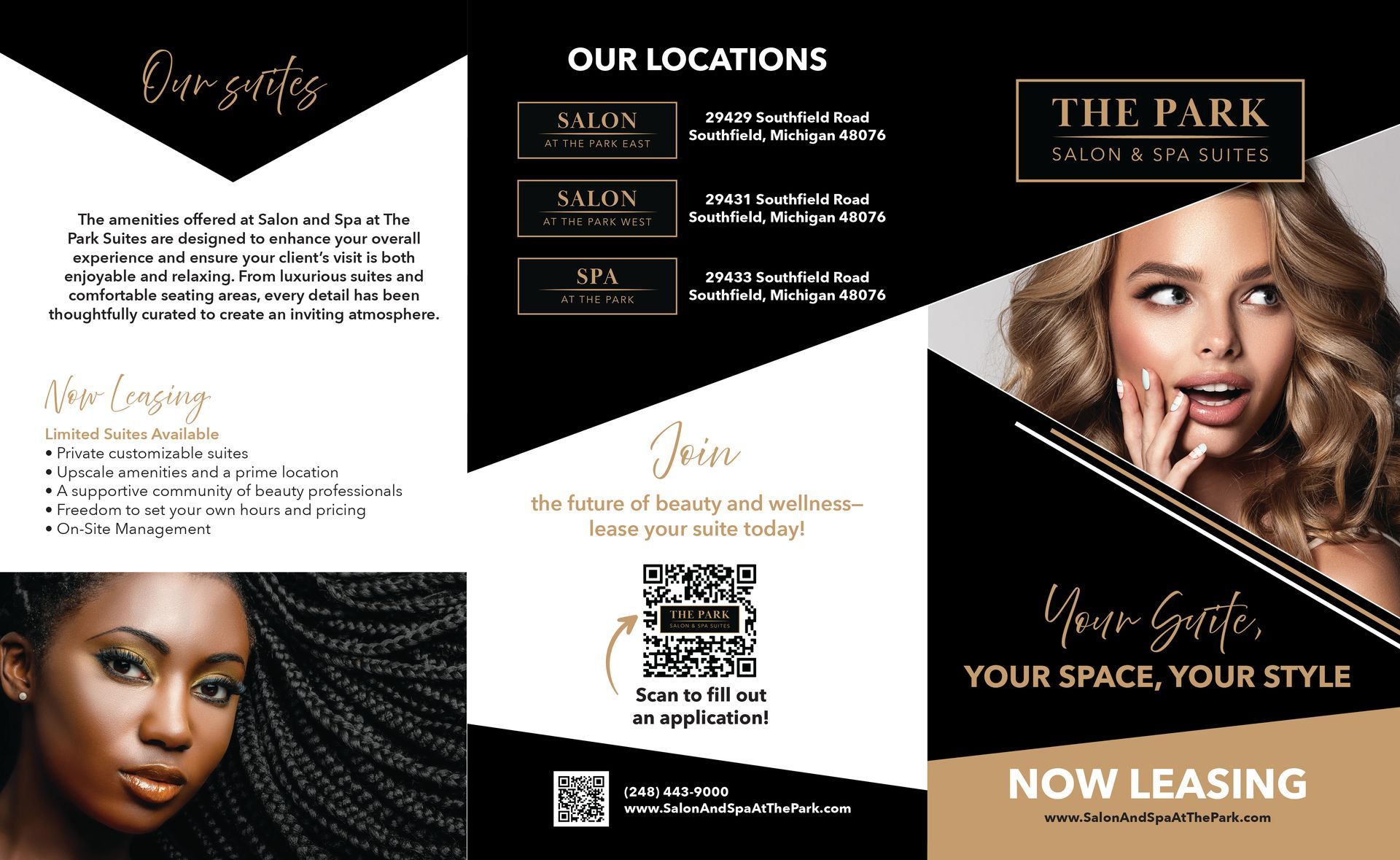
Tri-Fold Brochures: Elegant, Informative, On-Brand


We designed sleek printed brochures that translate the brand’s identity into tangible marketing materials—perfect for in-clinic display, event handouts, or leasing meetings. Each brochure reflects the gold-and-black theme while communicating key points like “Your Suite, Your Space, Your Style” and location-specific information for Salon and Spa at the Park.

Brochure Design

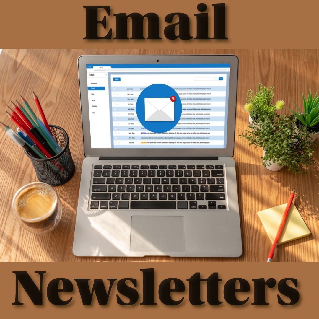
Email Blasts: Consistent & Impactful Messaging


To keep prospects and clients engaged, we crafted email templates that carry the same visual style and messaging. They highlight the luxurious suite options, encourage scheduling tours, and maintain brand cohesion from email to web to print.

Contact Us

Why It Works: Cohesive Branding for Maximum Impact

  • Uniform Aesthetic: The consistent gold-and-black visual identity enhances brand recognition.
  • Clear Messaging: “Your Suite, Your Space, Your Style” resonates across web, print, and email.
  • Multi-Channel Reach: From brochures to browser to inbox—every touchpoint speaks with one voice.


Results That Speak Volumes

The combined effect of rebranding, thoughtful web design, eye-catching brochures, and strategic email messaging gives Salon & Spa at the Park a compelling edge. Prospective lessees and visitors enjoy a unified, polished experience that reflects the upscale nature of the suites themselves.


💻 Interested in customizing your brand? Click here contact us and let’s put something special together!

November 12, 2025
Giving Thanks, Giving Local: Celebrating Community with Behind Your Design
By Chelsea Mills November 6, 2025
From Past to Presents: Gifts That Wow This Holiday Season
By Chelsea Mills October 14, 2025
Bringing Detroit’s Iconic Beverage Distributor to Life: Our Work with Eastown Distributors We recently had the pleasure of partnering with Eastown Distributors, a multi-generational, family-owned business with deep roots in Detroit’s history, on a brand-new website and photoshoot. Our goal was to showcase not only their products but also the legacy and reach of this iconic local company. The photoshoot started at sunrise in downtown Detroit, capturing some of the city’s most prominent locations that Eastown proudly delivers to, including Comerica Park, Fox Theatre, and Ford Field. These early-morning shots highlighted Eastown’s presence in the heart of the city and set the stage for a story that connects the brand to Detroit itself. We also ventured into everyday business operations, photographing merchandisers as they stocked shelves at grocery stores, and visiting independent retailers and neighborhood pubs to show Eastown products in action. This mix of iconic landmarks and real-world environments brought a sense of authenticity to the campaign, illustrating the company’s reach and dedication to its customers. On the digital side, the new website features a BrandFinder tool, making it easy for users to discover which brands Eastown distributes and where to find their favorite beverages. This user-friendly feature ensures that fans of Eastown’s products can quickly locate them, whether at local pubs, grocery stores, or specialty retailers. Working with Eastown was exciting because it allowed us to highlight both the people and the places that make the company such a vital part of Detroit’s beverage landscape. From family legacy to modern operations, this project celebrates everything that makes Eastown Distributors unique, and we’re proud to have brought their story to life online and through photography.
By Angela Hanners October 14, 2025
Create Your Own Custom Neon Signage for Your Company
A new website design for Tanglewood Assisted Living Memory Care
October 8, 2025
Elevating the Tanglewood Brand At Behind Your Design, we believe good design should do more than just look pretty - it should connect, inform, and support the people it's made for. That’s why partnering with Tanglewood Assisted Living has been such a meaningful project for our team. As a trusted support system for families navigating Alzheimer’s and dementia care, Tanglewood Assisted Living sought refreshed branding that reflected clarity, compassion, and consistency. We were honored to collaborate with them, creating a new logo and marketing materials to help bring their vision to life.
A black blanket is sitting on a white chair
October 2, 2025
Experience Buttery Soft Comfort
Show More